inspiration + perspiration = invention :: T. Edison ::
It's the penultimate day of my Northanger Abbey week, and time to reveal the cover of my upcoming sequel. But first, let's see how books were illustrated and promoted in the past.
Henry Tilney himself mentions the subject in Chapter 14 of Northanger Abbey:
"Miss Morland has been talking of nothing more dreadful than a new publication which is shortly to come out, in three duodecimo volumes, two hundred and seventy-six pages in each, with a frontispiece to the first, of two tombstones and a lantern—do you understand?"

At that time a book's exterior was not much to look at. Instead, it was the page opposite the title that caught the eye. The Mysteries of Udolpho (inspiration of Catherine's Gothic imaginings) first appeared in 1794 as a beautifully bound but plain set of four volumes. Instead the 1803 edition contains the illustration now often used as a cover.

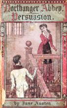
Northanger Abbey itself got short shrift on arrival, sharing a volume set with Persuasion of little embellishment. There's a great article over at the Jane Austen Society of North America exploring how these works became cheaper to produce and steadily more popular over time, including pictures of the various covers printed through the years. I'm especially fond of the 1897 one where Mr. Tilney sports some very Victorian muttonchops on his way up the staircase to a composed and not at all startled Catherine.

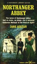
It's not until the 20th century that I can tell Northanger Abbey was finally published solo, with a great variety of designs: floral, abstract, realistic, and wholesale copying from Austen's more well known works (especially since Pride and Prejudice was filmed in 1940). There's even a wild 1965 paperback which leans full tilt into genre "terror," unaware of how the novel parodies these conventions.
After 200 years we now have a rich variety of looks for this tale. Love it or hate it, the 2007 movie has spawned numerous memes online. There's a graphic novel from Marvel, at least two webseries with their own fanart, and full scans online of all the artwork that has graced this story's pages. I like to think we're finally at a moment when the gentle nature of Austen's least angsty couple has found its audience.
So now, without further ado, let's move on to my humble contribution to this story's gallery.

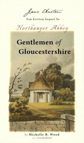
This engraving comes from the monthly Repository of Arts (February 1, 1821), titled "Gamekeeper's Lodge." It's not how I envision the Tilney's home but matches the feeling I wanted: a simple house as opposed to a grand estate, with just a hint of menace in the air. Hat tip to Evelyn Kennedy Duncan's blog for pointing me to this image through the magic of search engines.
Here's the blurb describing what Gentlemen of Gloucestershire is about. Come back tomorrow for the first chapter, and be sure to comment on what your favorite cover design is.
Mrs. Catherine Tilney née Morland began her marriage to the Reverend Henry Tilney with every expectation of happiness. When a crisis emerges and her new family is put in danger, she must become the heroine she has been in training for all her life.
A sequel to Northanger Abbey featuring dramatic scenarios, comic situations, witty banter, and hopefully wisdom gained through the evolving relationship of a young couple with plenty to learn about themselves and each other.


