inspiration + perspiration = invention :: T. Edison ::
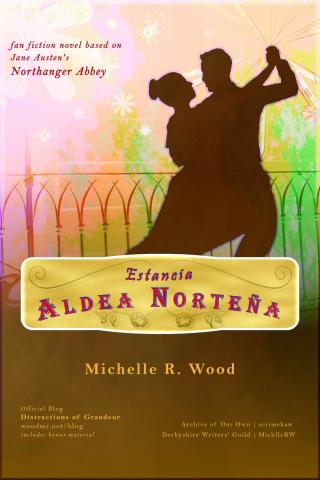
It's the day before Epiphany, and thus the day before the first chapter of Estancia Aldea Norteña goes live. It's also time to reveal the cover artwork for this novel. But first, a few words about the design.
I like for cover artwork to evoke the mood of a story rather than just focus on pretty images; the font, imagery, and complete feel should transport the potential reader into the story. It's for that reason I prefer to keep people's faces to a minimum or shadowed rather than the movie poster "stare right at you" look. With Regency stories, I stick to artwork from that time period, and use font that evokes an older era.
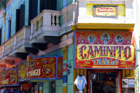
This novel, though, takes place in a completely different setting, and needed to convey the world of Argentine ranches and telenovelas. These television dramas had already been a main focus of my research, since the protagonist's fandom forms a large part of her characterization and some pivotal plot points, taking the place of Gothic fiction in Northanger Abbey. Here are some of the ads that most influenced me:

Telenovela posters for Romeo y Julieta, Teen Angels, Floricienta, and Dulce Amor.

Caminito Facade Buenos Aires (pixabay).
This last picture particularly caught my eye and informed the title card lettering, already revealed. Next I looked for gradients, backgrounds, and went through multiple drafts in my goto photo editor GIMP playing with layers, textures, and styles. If there's later interest, I may post a step-by-step walk through of this process. But for now I'll let the finished cover speak for itself:

The base image comes from pixabayVintage Roses Flourish Line Art and Asterisk Symbol (the later getting revamped in multiple variations for the playful sparks of color in the air).
I'm very pleased with how the cover eventually came out, which was a lot of fun to put together, and also overjoyed to finally share this tale with the world. Come back tomorrow for the first episode, er, chapter of Estancia Aldea Norteña.


